[1,944 words, 10 min estimated read time]
Last year in 2024 I decided I’d like to design an avatar in case I ever ended up making Youtube videos- the Youtube thing hasn’t happened yet, but I figured it’d still be nice to outline how I designed the sona for it in the meantime!
Wait whats a ‘Sona’ anyway?
For anyone who may not know what a sona is, it’s basically a character who represents the artist. Sona’s can deviate a lot from what the artist actually looks like, and the amount of artistic liberties can range from a few small changes to making a completely nonhuman character that looks nothing like the artist. It’s more about the vibes than an actual carbon copy of the artist’s appearance!
I think This Post on Character Hub does a pretty good job explaining the difference between a ‘sona’ and other ‘original characters’
Brainstorming Stage
I wanted something that would fit the aesthetic I was going for, so I asked some of my friends to give me a list of things they associated me with to help me brainstorm ideas.


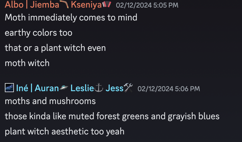

Mushrooms were definitely a common one, along with different kinds of plants. Moss was brought up, along with a shrub or fruiting tree. This made me think of ferns which I also thought would be very fitting.
Moths also got brought up- it’s what I’ve been using as my icon for a while now, and I do really enjoy it. I started thinking of ways I could incorporate it into the design, maybe some moth antenna or wings, or even just the symbol of a moth somewhere in the clothing.
Another theme that popped up a lot was a witch. Moth witch, plant witch, gotta have some witchy vibes, which I was all for, I love that. One of my friends also said specifically a woodland entity which my brain definitely latched onto, I loved that description.
In terms of colors, earthly colors were mentioned which I find fitting, along with forest greens and grayish blues. I definitely wanted to bring in some nice greens and browns to the design for sure, and I grabbed a bunch of color palettes I liked. I’m a big fan of autumn colors too so I played around with warmer color palettes, adding in tans and orangey yellows to the mix.
And then someone had to go and send written prose in response that left me kinda tearing up a little bit because of how in depth and sweet it was! You know who you are!

It seemed like my friends had a pretty cohesive aesthetic for what they pictured for me, both people I knew in my day to day life and people I’d only known online, which honestly made things so much easier for me. I made a list of design elements I thought would be fun to include, things like big witch hats and moth antenna.
Looking at PNGtubers
After this I pulled back and started digging into more of the technical side of it by looking at the sona designs Youtubers used, particularly ‘pngtuber’ styles, where they use a series of static images that change to express as they talk.
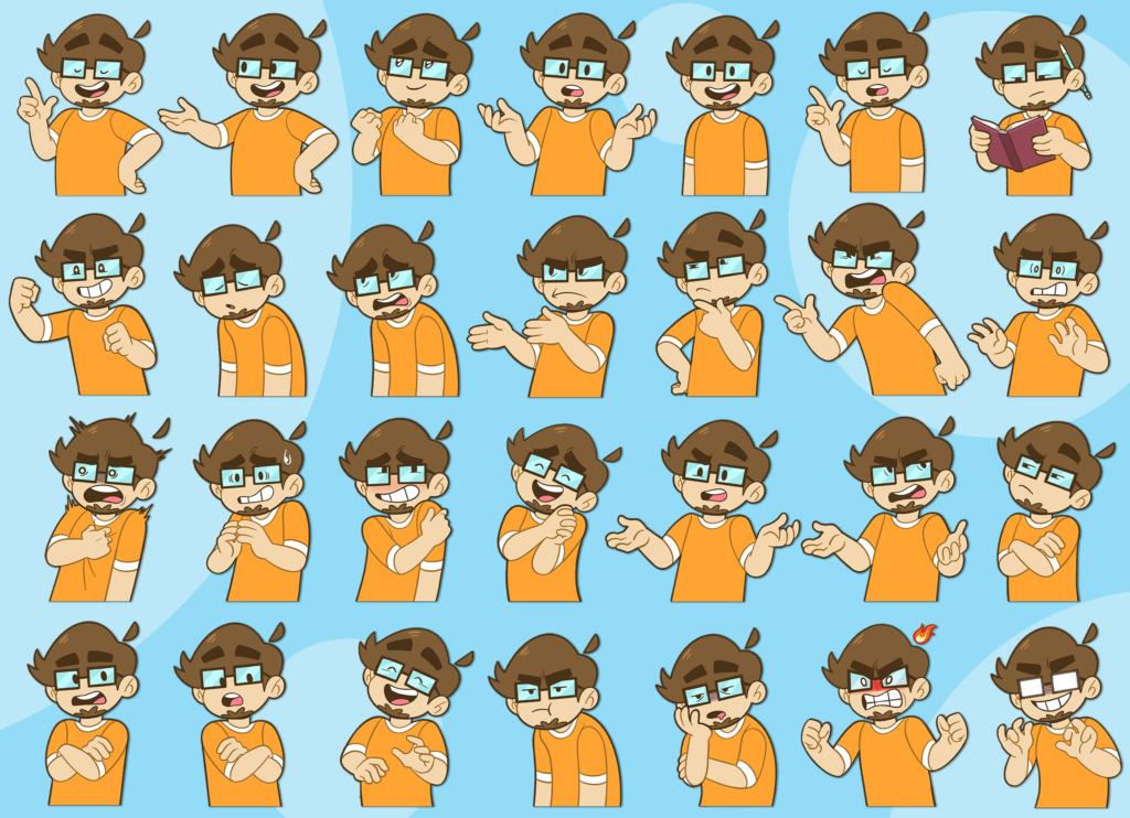
[For example the avatar design for the Youtube Channel Saberspark, designed by Rishi]
I looked at how many different expressions and poses they had to get a feel for how many I should be making myself. I wanted to learn how I could mix and match facial expressions with body posing to get as large of a range of expression as possible, with a minimal number of actual different drawings.
I looked at how long the cuts were between each static image. Was it at the end of each sentence? In the middle of sentences? I found some switched about every two seconds on average, while others switched about every ten seconds. I preferred the ones that switched between images less frequently, not only to lessen the amount of work it would take editing the video later, but also because it helped give a more leisurely, chill feeling.
Design Attempt #1
I brought together a lot of the design elements I wanted to work with; big witch hat with moss hanging off the side, moth antenna, things like that. I found that I liked outfits that had overalls and overall shorts, so I added that with a big sweater for the outfit. For the face I wanted to give them a not-quite human mouth, kinda going for almost little fangs or something insectoid? I also made the eyes dark with just little pinpricks of white for the pupils, I thought this would help lean more into the ‘woodland entity’ vibes my friend recommended. In the middle of designing them I also came up with the idea to make the front pouch on the overall shorts an acorn which I thought would be cute.
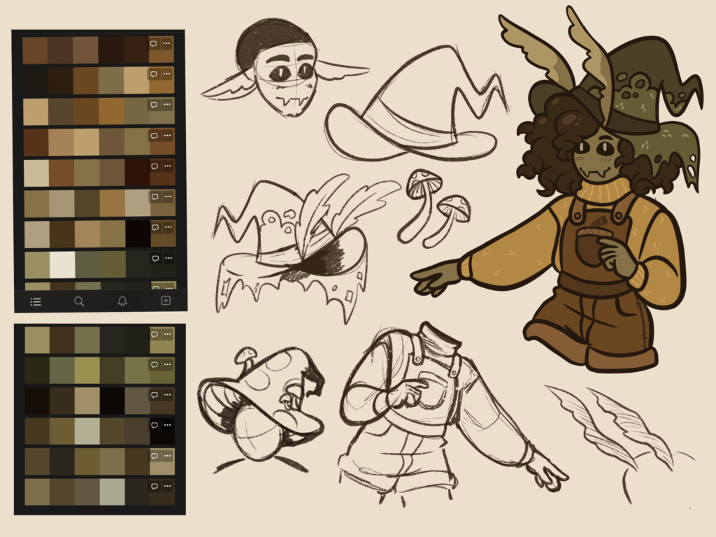
Once I finished I took a step back and… it was okay? It’s not that I didn’t like the design, but it still didn’t quite feel like me. It felt more like just a muddled mishmash of the aesthetics I’d compiled and less like I’d come up with something and used the aesthetic ideas as elements for the design, rather than the design itself.
I really liked the first design and I’m glad I made it, but it just wasn’t quite what I was going for in the end. So, for a while, I set it to the side to brainstorm a bit more about why I didn’t feel like it fit me, and keep an eye out for some more ideas.
Back to Brainstorming
Along the way, I came across the artist Sutexii, and I think their sona design is SO COOL. And I thought to myself that’s it, the feeling I get from seeing this sona that’s what I want mine to feel like! A forest creature. A woodland entity. Something humanoid but clearly not human.
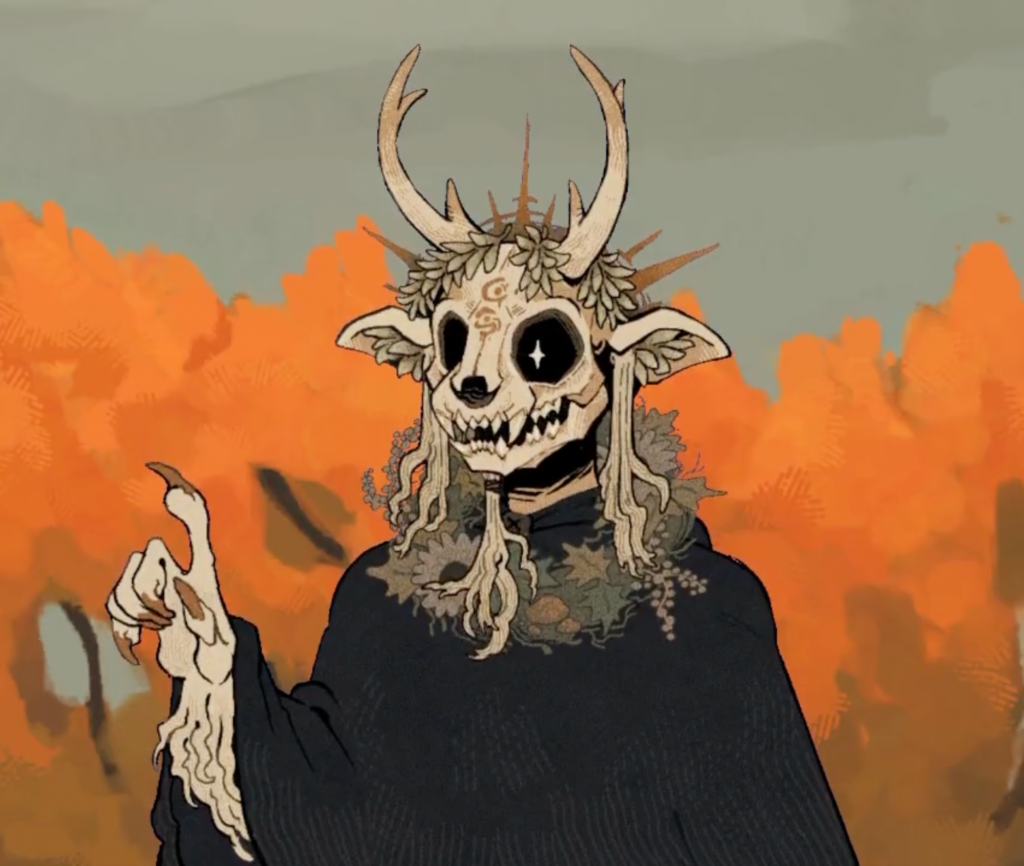
I really liked the way the eyes look, I’d had a similar idea in mind and seeing it on their pngtuber design made me sure I wanted to keep this as an element, it worked so well for the aesthetic! The skull is a really cool touch too, along with the symbols lightly carved into it. I also liked the way that Sutexii used a simple cloak for their avatar- it’d be easier to draw, and it adds a bit of that mysterious element that I like about their sona’s design!
I decided to look through some of their other art to see if there were other elements for creatures they drew that I liked! I noticed a lot of horns and long fangs. I also liked the idea of thorns and vines too, I thought that was really cool.
Another artist I was reminded of by this aesthetic was Bree Paulsen. Lots of creatures, lots of natural but inhuman. A lot of them wear hoods that cover their eyes, and long tattered cloaks. And when they did wear clothes it had an old fashioned feel to them. I also really liked the overall color palettes she uses.
I was also reminded of Guillermo del Toro’s creature designs, like the faun from Pan’s Labyrinth or the Sphinx from Pinocchio.
Design Attempt #2
Now that I knew I wanted to go more creature with my design, I went back to the drawing board. I started off trying out different horn shapes, moth antenna, and big fluffy ears.
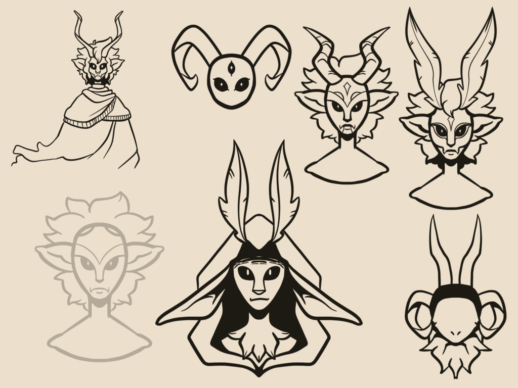
I liked the first sheet of ideas but had someone point out the mouth I had picked for some of these would be difficult to emote with, so I tried to think of different ways to design the mouth. In particular I ended up really liking the design in the top left corner, and the two on the top right. I liked the fluffiness around the face with the hair and ears, and the tall horns and antenna I had used.
For the next page I kept playing around with ideas, trying to think of some colors too.
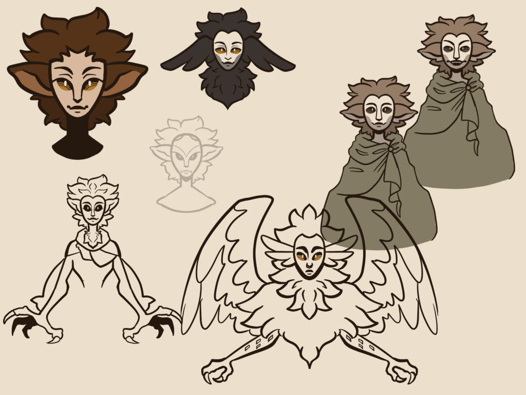
I liked the look of the dark fur around a pale face. I had someone point out too that it might be better to make the design less dark, since a lot of my art tends to fall into darker colors. If my sona design also used dark colors it’d probably blend in with a lot of my artwork, especially in thumbnail images for videos. I played around with paler greens and tan colors, and liked the colors of the drawing on the right side.
After this I started trying to combine the ideas. I ended up taking the cloak design from the first page drawing I liked, along with the fluffy bits of hair framing either side of the face. I went with the moth antenna instead of horns, I think they’ll be easier to draw more consistently and simplify too if I want. From there I went with the lighter, more muted color palette I had liked from the second page drawing, and…. I loved it.
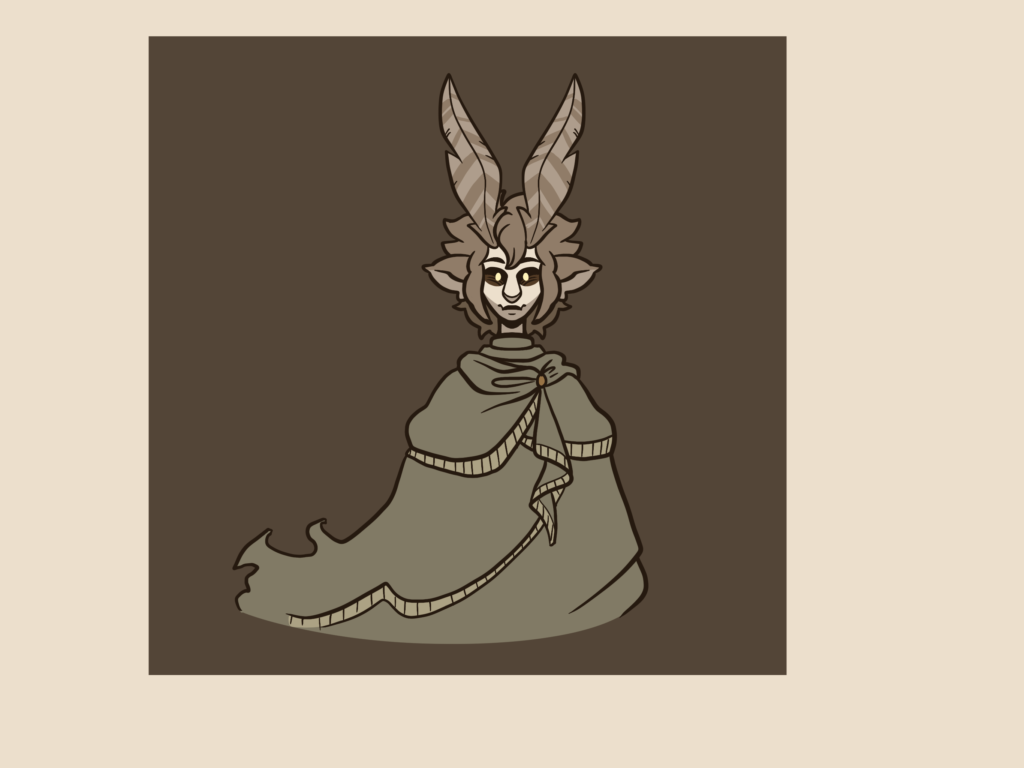
While I still didn’t lean quite as heavily into a creature feeling to it as I could have, I still felt like it had an inhuman feel to it that I really liked. I was also really happy with the color palette, I was hesitant at first to go with a lighter one but I felt like it worked out really well.
From here I could just mess around with the design a bit more. I wanted to add some wear and tear to the cloak they’re wearing, and I wasn’t completely sold on the color of the pupils for the eyes, but I felt so much happier with the design overall. I could picture pretty clearly how this character would emote and gesture too.
Finishing up the Design
I sat with the design for a while to be sure it’s what I wanted, and even coming back to it later I still felt really good with it. I loved the earthy tones for them, and I was really liking how the moth antenna turned out. So finally I went ahead and worked on a full character sheet.
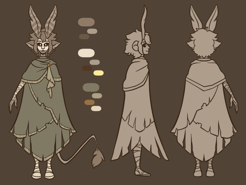
Next, I needed to work on some poses and expressions. I went through some of the expressions other youtubers used for their avatars, seeing which ones I might like to recreate with my own avatar.

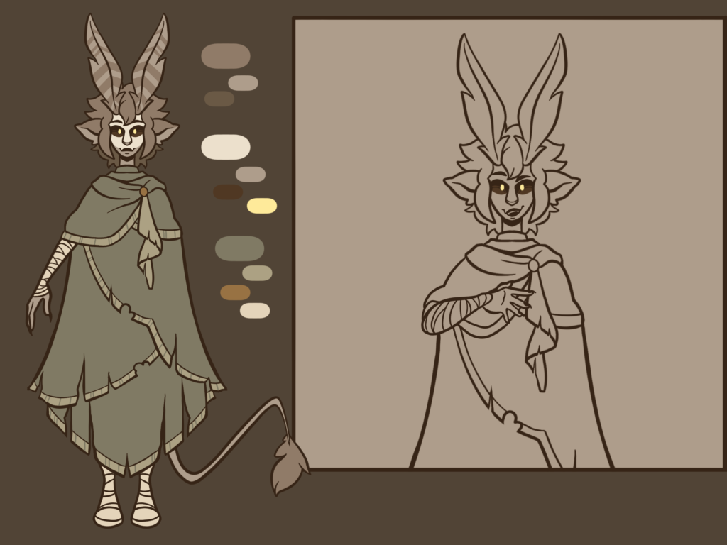
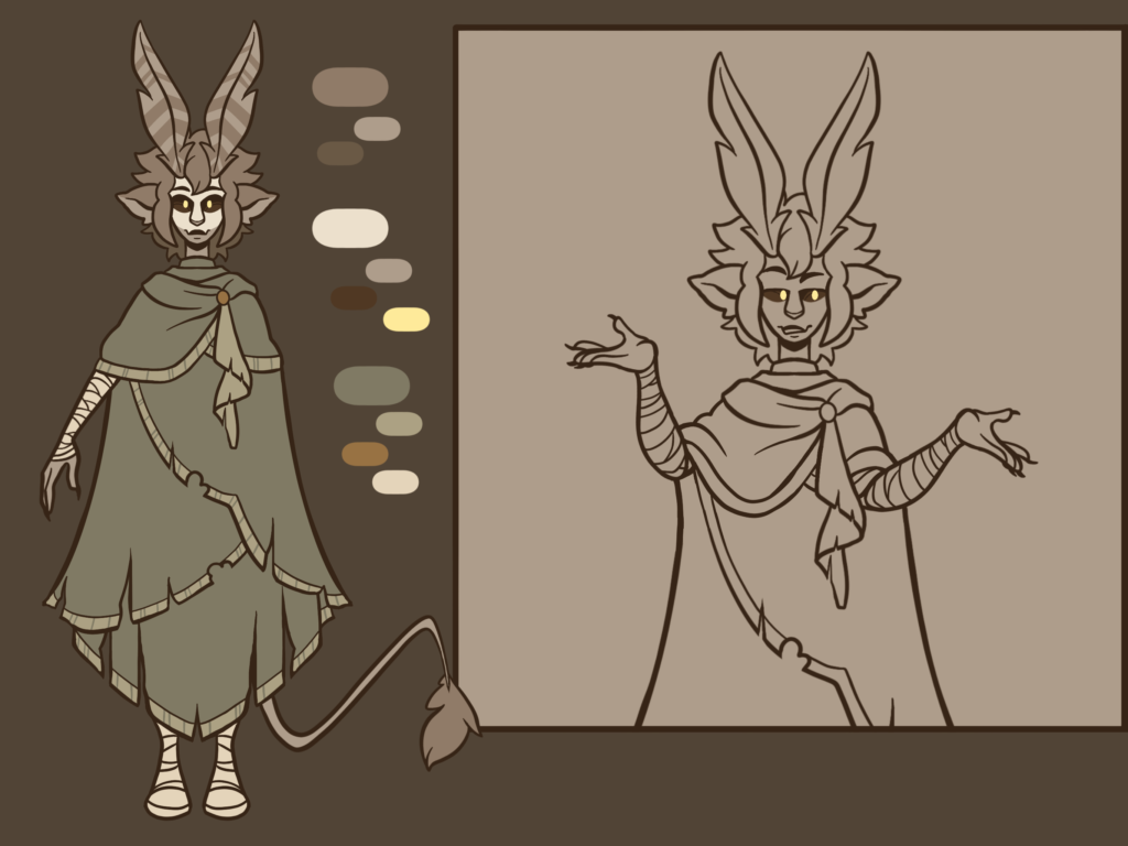
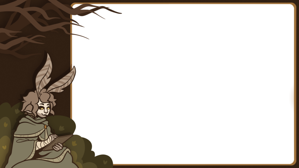
After that I decided to pivot a bit and figure out what I would like to do for an overlay, something to put on screen overtop whatever I was drawing. I know I wanted to have my sona in it off to the side drawing, and I wanted it to be in a forest (but not too detailed that it pulled away from what I was drawing on screen!) I ended up going with a simple bush behind my character and some tree branches above, and made the border dark brown like the trees would be. I figured later if I want I can even add a small animation to it, maybe with the pencil scribbling or the antenna moving, but for now it served its purpose just being a static image.
Overall I’m really happy with how this design came together. Since then I’ve started using them for my icon pics on social media, and I’d like to use them more frequently! I learned a lot of stuff along the way, and I hope you found the process enjoyable to read about! Maybe it’ll inspire some of you guys to make a sona as well, just for the fun of it.
Leave a Reply